#
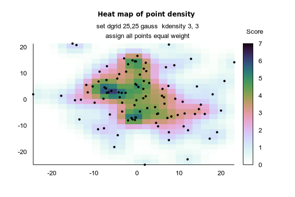
# Demo for creating a heat map from scattered data points.
# Plot 1
# dgrid cheme "gauss kdensity" with unit weight (z=1)
# for each point yields a heat map of point density.
# The color indicates local point density.
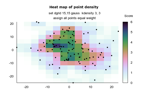
# Plot 2
# Same scheme as plot 1 but using a finer grid
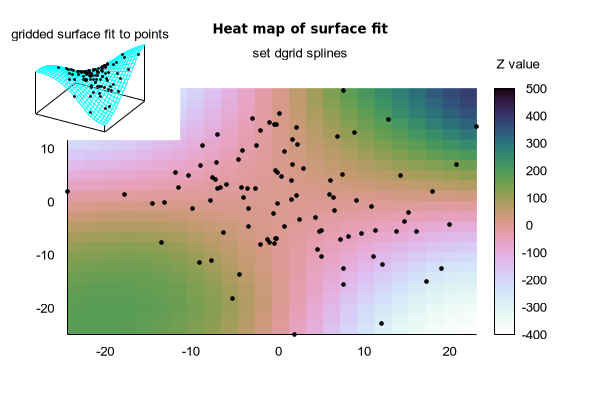
# Plot 3
# dgrid scheme "splines" uses measured z value of each
# point to fit a 3D surface that passes approximately
# through each point [x,y,z]. The color indicates the
# z value of this surface.
#
# Specify a 15 x 15 grid using "set dgrid".
# Each point contributes a Gaussian density component weighted
# by its distance from the grid point; i.e. grid boxes with
# more nearby points receive a higher value.
# Note: Many other weighting schemes are possible.
#
unset key
set view map
set tmargin 4
set palette cubehelix negative
set tics scale 0
set xtics 10
set ytics 10
set xrange noextend
set yrange noextend
set border 10
set label 1 "Heat map of point density " font ":Bold"
set label 2 "set dgrid 15,15 gauss kdensity 3, 3"
set label 3 "assign all points equal weight"
set label 1 center front at screen 0.5, 0.93
set label 2 center front at screen 0.5, 0.87
set label 3 center front at screen 0.5, 0.82
set label 4 center at graph 1.1, 1.1 "Score"
set dgrid 15,15 gauss kdensity 3, 3
splot 'mask_pm3d.dat' using 1:2:(1) with pm3d, \
'' using 1:2:(1) with points lc "black" pt 7 ps 0.6 nogrid
Click here for minimal script to generate this plot